














Upside-Down World Map, 2026: South-up, Pseudo-Mercator, Colour Coded Countries
Eine moderne Karte von 2026, auf Premiummaterial gedruckt. Vollständige Beschreibung
Das Sammlerangebot
Wählen Sie zwei berechtigte Werke und erhalten Sie auf beide 20 % Rabatt. Wählen Sie drei, und das günstigste ist kostenlos – eine maximale Ersparnis von 33 %.
Kombinieren Sie berechtigte Standardkarten und Kunstdrucke nach Belieben. Kein Code erforderlich; das Angebot wird an der Kasse automatisch angewendet.
Standardmäßige Konfigurationen nach Maßanfertigung sind inbegriffen. Maßgeschneiderte Größen, personalisierte Entwürfe und Auftragsarbeiten sind ausgeschlossen.
Benötigen Sie die Lieferung an unterschiedliche Adressen? Kontaktieren Sie uns vor der Bestellung.Das Sammlerangebot
Wählen Sie zwei berechtigte Werke und erhalten Sie auf beide 20 % Rabatt. Wählen Sie drei, und das günstigste ist kostenlos – eine maximale Ersparnis von 33 %.
Kombinieren Sie berechtigte Standardkarten und Kunstdrucke nach Belieben. Kein Code erforderlich; das Angebot wird an der Kasse automatisch angewendet.
Standardmäßige Konfigurationen nach Maßanfertigung sind inbegriffen. Maßgeschneiderte Größen, personalisierte Entwürfe und Auftragsarbeiten sind ausgeschlossen.
Benötigen Sie die Lieferung an unterschiedliche Adressen? Kontaktieren Sie uns vor der Bestellung.
Eine moderne Karte von 2026, auf Premiummaterial gedruckt. Vollständige Beschreibung
Choose your size
Choose your finish


(Mehr Infos)
Geschenkmitteilung & individuelle Ausführung

Wenn Sie eine Geschenkmitteilung oder eine Ausführung (Puzzle, Aluminiumplatte usw.) hinzufügen möchten, die hier nicht verfügbar ist, geben Sie dies bitte in der "Bestellnotiz" beim Checkout an.
Jede Bestellung wird individuell angefertigt. Wenn Sie die Größe leicht anpassen oder auf einem ungewöhnlichen Material drucken lassen möchten, lassen Sie es uns einfach wissen. Wir haben im Laufe der Jahre Tausende von individuellen Bestellungen bearbeitet, daher gibt es (fast) nichts, was wir nicht bewältigen können.
Sie können uns auch kontaktieren, bevor Sie bestellen, wenn Sie möchten!
Ein Stück Geschichte für Ihr Zuhause
Über 8.000 5-Sterne-Bewertungen


Upside Down World Map by The Unique Maps Co. (2026) overturns the familiar north-up convention to give the Southern Hemisphere pride of...
WeiterlesenUpside Down World Map by The Unique Maps Co. (2026) overturns the familiar north-up convention to give the Southern Hemisphere pride of place, while preserving the legibility of a modern political chart. Rendered in a pseudo-Mercator projection, it keeps the straight parallels and meridians—and the expected high-latitude exaggerations—that make global outlines instantly recognizable. A contemporary palette assigns distinct hues to every country, with lucid, unfussy typography and soft ocean tones that let information breathe. A discreet grid overlays the seas, offering bearings without clutter. The result is a deft balancing act: a map that looks comfortingly orthodox at first glance, yet quietly rewires perspective, inviting viewers to interrogate the cultural habits that have long defined which parts of the world appear “on top.”
By literally flipping the frame, this composition joins a lineage of south-up cartography that stretches from medieval and Islamic traditions to late-20th-century corrective maps, while acknowledging how the north-up standard crystallized with European navigation and Mercator’s 16th‑century projection. Its use of a pseudo-Mercator—ubiquitous in contemporary web mapping—anchors the experiment in visual familiarity even as the orientation challenges bias. The labeled oceans and seas, plotted over a fine graticule, signal analytical seriousness rather than novelty for novelty’s sake. In doing so, the map reframes geography as a set of conscious choices—projection, centering, and “upness”—not immutable truths, and it encourages a more plural understanding of the world’s political imagination.
Visually, the inversion lends fresh prominence to regions often relegated to cartographic margins. Australia and New Zealand rise to commanding positions near the upper sweep of the Pacific, their coastlines crisply delineated against the Indian and Southern Oceans. South America asserts a graceful verticality above a recontextualized North America, with Brazil’s vast interior reading as a crown rather than a footnote. Across the lower edge, Antarctica forms a luminous, continuous counterweight, a glacial baseline anchoring the composition. Island chains thread the central waters: Hawaii steps across the mid-Pacific like a hinge between hemispheres, while the Indonesian archipelago and the scattered jewels of the Indian Ocean gain renewed coherence in this orientation. Clear labels for the Atlantic, Pacific, Indian, Arctic, and Southern Oceans, along with key seas, tether the eye amid the delightful disorientation.
As a political map, its color coding and clean labeling render complex sovereignty legible at a glance, yet the flipped vantage subtly reorders cognitive hierarchies. The Russian Federation and Canada still sprawl with projection-amplified breadth, a reminder of pseudo-Mercator’s polar magnification, but they now occupy the visual “down” space, challenging instinctive associations between size, elevation, and importance. China’s continental heft and the United States’ familiar outline are instantly readable, but re-situated beneath newly eminent southern lands. Europe appears as an elegant promontory below a lofted Africa, while longitudinal spacing across the grid clarifies transoceanic relationships. This interplay of distortion, order, and inversion makes the map a primer on how design choices shape geopolitical perception.
More than décor, this is a conversation engine—an elegant instrument for classrooms, studios, and boardrooms where perspective matters. It foregrounds the arbitrariness of “up” and “down,” inviting debates about educational norms, navigation history, and the cartographic echoes of power. The subtle grid and meticulous toponyms temper the provocation with scholarly poise, while the contemporary palette gives modern polish to a centuries-old argument. Viewers find themselves mentally rotating coastlines, recalibrating distances, and reconsidering center and margin, especially across the Pacific where island nations gain narrative gravity. In the end, Upside Down World Map is both a faithful political atlas and a quiet manifesto: a beautifully reasoned case for looking at the world, quite literally, from another angle.
Countries and regions on this map
- Australia
- Brazil
- Canada
- China
- Russian Federation
- United States
- Antarctica
- Various islands in the Pacific and Indian Oceans (e.g., New Zealand, Hawaii, etc.)
Notable Features & Landmarks
- Continent Orientation: The world is flipped upside down, significantly altering conventional perceptions of continent locations.
- Color Coding: Each country is distinctly colored, facilitating clear identification.
- Labeling: Countries are labeled clearly, enhancing ease of understanding.
- Ocean and Sea Names: Key oceans and seas are marked, reinforcing geographical context.
- Grid Overlay: A subtle grid is present, adding functional elements for navigation.
Historical and design context
- Year of Creation: 2026
- Mapmaker/Publisher: The Unique Maps Co.
- Theme: A detailed political map that challenges traditional geographic perspectives by flipping the world upside down.
- Projection: Utilizes a pseudo-Mercator projection, maintaining the proportions and distortions typical of traditional world maps.
- Design: Contemporary color palette with clear country delineation and labeling; soft ocean tones and a subtle grid enhance cartographic credibility.
- Geographic Significance: Highlights the Southern Hemisphere by positioning it at the top, contrasting with conventional Eurocentric north-up maps and encouraging reconsideration of assumptions.
- Visual Impact: The inversion makes regions such as South America and Australia prominent; Antarctica features prominently across the lower edge.
- Discussion Potential: Serves as a statement piece, provoking dialogue on cultural biases in mapping and the arbitrary nature of “up” and “down” orientations.
Please double check the images to make sure that a specific town or place is shown on this map. You can also get in touch and ask us to check the map for you.
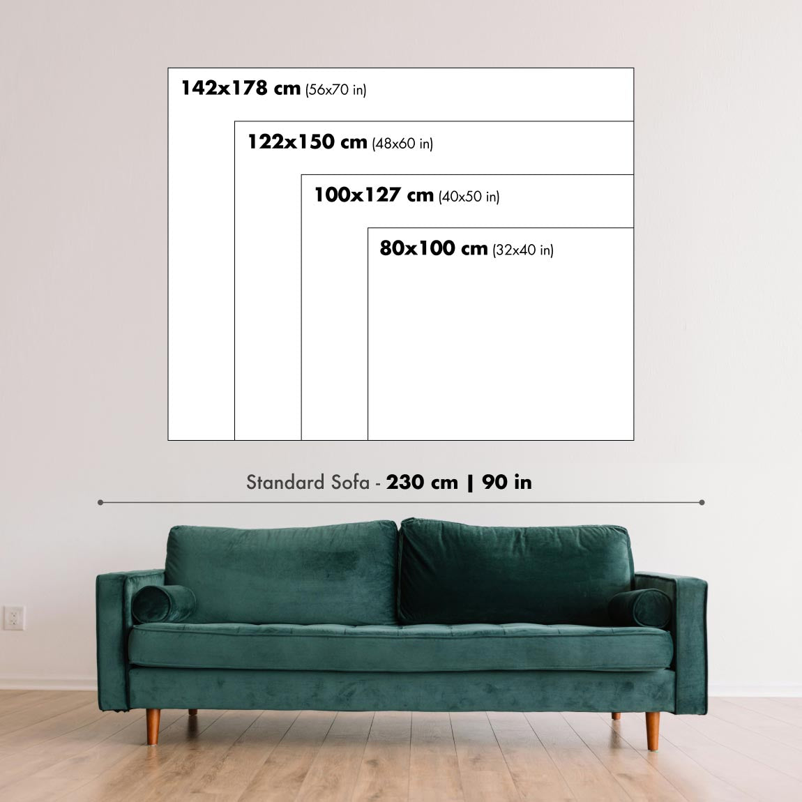
This map looks great at every size, but I always recommend going for a larger size if you have space. That way you can easily make out all of the details.
This map looks amazing at sizes all the way up to 100in (250cm). If you are looking for a larger map, please get in touch.
The model in the listing images is holding the 18x24in (45x60cm) version of this map.
The fifth listing image shows an example of my map personalisation service.
If you’re looking for something slightly different, check out my collection of the best old maps to see if something else catches your eye.
Please contact me to check if a certain location, landmark or feature is shown on this map.
This would make a wonderful birthday, Christmas, Father's Day, work leaving, anniversary or housewarming gift for someone from the areas covered by this map.
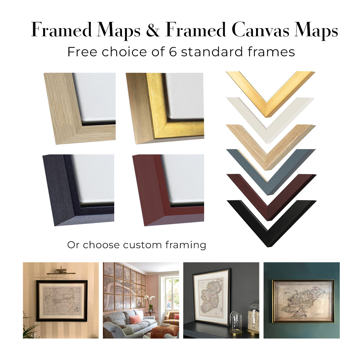
This map is available as a giclée print on acid free archival matte paper, or you can buy it framed. The frame is a nice, simple black frame that suits most aesthetics. Please get in touch if you'd like a different frame colour or material. My frames are glazed with super-clear museum-grade acrylic (perspex/acrylite), which is significantly less reflective than glass, safer, and will always arrive in perfect condition.
This map is also available as a float framed canvas, sometimes known as a shadow gap framed canvas or canvas floater. The map is printed on artist's cotton canvas and then stretched over a handmade box frame. We then "float" the canvas inside a wooden frame, which is available in a range of colours (black, dark brown, oak, antique gold and white). This is a wonderful way to present a map without glazing in front. See some examples of float framed canvas maps and explore the differences between my different finishes.
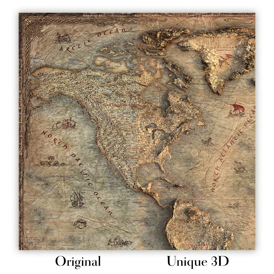
For something truly unique, this map is also available in "Unique 3D", our trademarked process that dramatically transforms the map so that it has a wonderful sense of depth. We combine the original map with detailed topography and elevation data, so that mountains and the terrain really "pop". For more info and examples of 3D maps, check my Unique 3D page.
Upside Down World Map by The Unique Maps Co. (2026) overturns the familiar north-up convention to give the Southern Hemisphere pride of place, while preserving the legibility of a modern political chart. Rendered in a pseudo-Mercator projection, it keeps the straight parallels and meridians—and the expected high-latitude exaggerations—that make global outlines instantly recognizable. A contemporary palette assigns distinct hues to every country, with lucid, unfussy typography and soft ocean tones that let information breathe. A discreet grid overlays the seas, offering bearings without clutter. The result is a deft balancing act: a map that looks comfortingly orthodox at first glance, yet quietly rewires perspective, inviting viewers to interrogate the cultural habits that have long defined which parts of the world appear “on top.”
By literally flipping the frame, this composition joins a lineage of south-up cartography that stretches from medieval and Islamic traditions to late-20th-century corrective maps, while acknowledging how the north-up standard crystallized with European navigation and Mercator’s 16th‑century projection. Its use of a pseudo-Mercator—ubiquitous in contemporary web mapping—anchors the experiment in visual familiarity even as the orientation challenges bias. The labeled oceans and seas, plotted over a fine graticule, signal analytical seriousness rather than novelty for novelty’s sake. In doing so, the map reframes geography as a set of conscious choices—projection, centering, and “upness”—not immutable truths, and it encourages a more plural understanding of the world’s political imagination.
Visually, the inversion lends fresh prominence to regions often relegated to cartographic margins. Australia and New Zealand rise to commanding positions near the upper sweep of the Pacific, their coastlines crisply delineated against the Indian and Southern Oceans. South America asserts a graceful verticality above a recontextualized North America, with Brazil’s vast interior reading as a crown rather than a footnote. Across the lower edge, Antarctica forms a luminous, continuous counterweight, a glacial baseline anchoring the composition. Island chains thread the central waters: Hawaii steps across the mid-Pacific like a hinge between hemispheres, while the Indonesian archipelago and the scattered jewels of the Indian Ocean gain renewed coherence in this orientation. Clear labels for the Atlantic, Pacific, Indian, Arctic, and Southern Oceans, along with key seas, tether the eye amid the delightful disorientation.
As a political map, its color coding and clean labeling render complex sovereignty legible at a glance, yet the flipped vantage subtly reorders cognitive hierarchies. The Russian Federation and Canada still sprawl with projection-amplified breadth, a reminder of pseudo-Mercator’s polar magnification, but they now occupy the visual “down” space, challenging instinctive associations between size, elevation, and importance. China’s continental heft and the United States’ familiar outline are instantly readable, but re-situated beneath newly eminent southern lands. Europe appears as an elegant promontory below a lofted Africa, while longitudinal spacing across the grid clarifies transoceanic relationships. This interplay of distortion, order, and inversion makes the map a primer on how design choices shape geopolitical perception.
More than décor, this is a conversation engine—an elegant instrument for classrooms, studios, and boardrooms where perspective matters. It foregrounds the arbitrariness of “up” and “down,” inviting debates about educational norms, navigation history, and the cartographic echoes of power. The subtle grid and meticulous toponyms temper the provocation with scholarly poise, while the contemporary palette gives modern polish to a centuries-old argument. Viewers find themselves mentally rotating coastlines, recalibrating distances, and reconsidering center and margin, especially across the Pacific where island nations gain narrative gravity. In the end, Upside Down World Map is both a faithful political atlas and a quiet manifesto: a beautifully reasoned case for looking at the world, quite literally, from another angle.
Countries and regions on this map
- Australia
- Brazil
- Canada
- China
- Russian Federation
- United States
- Antarctica
- Various islands in the Pacific and Indian Oceans (e.g., New Zealand, Hawaii, etc.)
Notable Features & Landmarks
- Continent Orientation: The world is flipped upside down, significantly altering conventional perceptions of continent locations.
- Color Coding: Each country is distinctly colored, facilitating clear identification.
- Labeling: Countries are labeled clearly, enhancing ease of understanding.
- Ocean and Sea Names: Key oceans and seas are marked, reinforcing geographical context.
- Grid Overlay: A subtle grid is present, adding functional elements for navigation.
Historical and design context
- Year of Creation: 2026
- Mapmaker/Publisher: The Unique Maps Co.
- Theme: A detailed political map that challenges traditional geographic perspectives by flipping the world upside down.
- Projection: Utilizes a pseudo-Mercator projection, maintaining the proportions and distortions typical of traditional world maps.
- Design: Contemporary color palette with clear country delineation and labeling; soft ocean tones and a subtle grid enhance cartographic credibility.
- Geographic Significance: Highlights the Southern Hemisphere by positioning it at the top, contrasting with conventional Eurocentric north-up maps and encouraging reconsideration of assumptions.
- Visual Impact: The inversion makes regions such as South America and Australia prominent; Antarctica features prominently across the lower edge.
- Discussion Potential: Serves as a statement piece, provoking dialogue on cultural biases in mapping and the arbitrary nature of “up” and “down” orientations.
Please double check the images to make sure that a specific town or place is shown on this map. You can also get in touch and ask us to check the map for you.
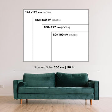
This map looks great at every size, but I always recommend going for a larger size if you have space. That way you can easily make out all of the details.
This map looks amazing at sizes all the way up to 100in (250cm). If you are looking for a larger map, please get in touch.
The model in the listing images is holding the 18x24in (45x60cm) version of this map.
The fifth listing image shows an example of my map personalisation service.
If you’re looking for something slightly different, check out my collection of the best old maps to see if something else catches your eye.
Please contact me to check if a certain location, landmark or feature is shown on this map.
This would make a wonderful birthday, Christmas, Father's Day, work leaving, anniversary or housewarming gift for someone from the areas covered by this map.
This map is available as a giclée print on acid free archival matte paper, or you can buy it framed. The frame is a nice, simple black frame that suits most aesthetics. Please get in touch if you'd like a different frame colour or material. My frames are glazed with super-clear museum-grade acrylic (perspex/acrylite), which is significantly less reflective than glass, safer, and will always arrive in perfect condition.
This map is also available as a float framed canvas, sometimes known as a shadow gap framed canvas or canvas floater. The map is printed on artist's cotton canvas and then stretched over a handmade box frame. We then "float" the canvas inside a wooden frame, which is available in a range of colours (black, dark brown, oak, antique gold and white). This is a wonderful way to present a map without glazing in front. See some examples of float framed canvas maps and explore the differences between my different finishes.
For something truly unique, this map is also available in "Unique 3D", our trademarked process that dramatically transforms the map so that it has a wonderful sense of depth. We combine the original map with detailed topography and elevation data, so that mountains and the terrain really "pop". For more info and examples of 3D maps, check my Unique 3D page.
Viele unserer Karten und Kunstdrucke werden als durchdachte Geschenke für Wohnungen, Büros, Arbeitszimmer und bedeutungsvolle Orte ausgewählt.
Wählen Sie eine gerahmte Option als das einfachste, fertig zum Aufhängen gelieferte Geschenk, oder entscheiden Sie sich für einen ungerahmten Druck, wenn der Empfänger seinen eigenen Rahmen lieber selbst auswählen möchte.
Wir fertigen Bestellungen lokal in 23 Ländern weltweit, sodass Geschenke oft in der Nähe des Empfängers produziert werden können. Das trägt dazu bei, dass sie schneller ankommen, sicherer transportiert werden und Überraschungen durch Zoll oder Einfuhrabgaben vermieden werden.
- Wir können direkt an den Empfänger liefern
- Gerahmte Werke werden fertig zum Aufhängen geliefert
- Ungerahmte Drucke werden sorgfältig in einer stabilen Schutzhülle versandt
- Nahezu jede Bestellung wird lokal gefertigt – für schnelleres und sichereres Schenken
- 90 Tage Rückgaberecht geben dem Empfänger Zeit für seine Entscheidung
Wenn Sie nicht sicher sind, was Sie wählen sollen, kontaktieren Sie uns bitte. Wir helfen Ihnen gern dabei, die passende Karte, Größe, Ausführung oder Lieferoption auszuwählen.
Für die meisten Bestellungen beträgt die Lieferzeit etwa 3 Werktage. Personalisierte und maßgeschneiderte Produkte benötigen länger, da ich die Personalisierung durchführen und sie Ihnen zur Genehmigung zusenden muss, was normalerweise 1 oder 2 Tage dauert.
Bitte beachten Sie, dass sehr große gerahmte Bestellungen in der Regel länger für die Herstellung und Lieferung benötigen.
Wenn Sie möchten, dass Ihre Bestellung bis zu einem bestimmten Datum ankommt, bitte kontaktieren Sie mich, bevor Sie bestellen, damit wir den besten Weg finden können, um sicherzustellen, dass Sie Ihre Bestellung rechtzeitig erhalten.
Ich drucke und rahme Karten und Kunstwerke in 23 Ländern weltweit. Das bedeutet, dass Ihre Bestellung lokal gefertigt wird, was die Lieferzeit verkürzt und sicherstellt, dass sie während der Lieferung nicht beschädigt wird. Sie zahlen nie Zoll oder Einfuhrgebühren, und wir stoßen weniger CO2 in die Luft aus.
Alle meine Karten und Kunstdrucke sind gut verpackt und werden in einem robusten Rohr versendet, wenn sie ungerahmt sind, oder von Schaum umgeben, wenn sie gerahmt sind.
Ich versuche, alle Bestellungen innerhalb von 1 oder 2 Tagen nach Erhalt Ihrer Bestellung zu versenden, obwohl einige Produkte (wie Gesichtsmasken, Tassen und Tragetaschen) länger zur Herstellung benötigen können.
Wenn Sie Express-Lieferung an der Kasse auswählen, priorisieren wir Ihre Bestellung und versenden sie per 1-Tages-Kurier (Fedex, DHL, UPS, Parcelforce).
Nächster Tag Lieferung ist auch in einigen Ländern verfügbar (USA, UK, Singapur, VAE), aber bitte versuchen Sie, früh am Tag zu bestellen, damit wir es rechtzeitig versenden können.
Lesen Sie meinen vollständigen Leitfaden zur Lieferung und lokalen Produktion
Mein Standardrahmen ist ein Galerie-Stil-Rahmen aus schwarzem Eschenholz. Er ist einfach und sieht ziemlich modern aus. Mein Standardrahmen ist etwa 20 mm (0,8 Zoll) breit.
Ich verwende super-klares Acryl (Plexiglas/Acrylt) für das Glas des Rahmens. Es ist leichter und sicherer als Glas – und es sieht besser aus, da die Reflexion geringer ist.
Sechs Standardrahmenfarben sind kostenlos erhältlich (schwarz, dunkelbraun, dunkelgrau, Eiche, weiß und antikgold).
Die meisten Karten, Kunstwerke und Illustrationen sind auch als gerahmte Leinwand erhältlich. Wir verwenden matte (nicht glänzende) Baumwollleinwand, spannen sie über einen nachhaltig beschafften Buchenrahmen und 'schweben' dann das Stück innerhalb eines Holzrahmens. Das Endergebnis ist ziemlich schön, und es gibt keine Verglasung, die im Weg ist.
Alle Rahmen werden "bereit zum Aufhängen" geliefert, entweder mit einer Schnur oder Halterungen auf der Rückseite. Sehr große Rahmen haben schwere Aufhängeplatten und/oder eine Montageschiene. Wenn Sie Fragen haben, können Sie bitte Kontakt aufnehmen.
Sehen Sie sich einige Beispiele meiner gerahmten Karten und gerahmten Leinwandkarten an.
Alternativ kann ich auch alte Karten und Kunstwerke auf Leinwand, Schaumstoffplatten, Baumwollrag und andere Materialien liefern.
Wenn Sie Ihre Karte oder Ihr Kunstwerk selbst rahmen möchten, lesen Sie bitte zuerst meinen Größenleitfaden.
Meine Karten sind äußerst hochwertige Reproduktionen von Originalkarten.
Ich beziehe originale, seltene Karten aus Bibliotheken, Auktionshäusern und Privatsammlungen auf der ganzen Welt, restauriere sie in meiner Londoner Werkstatt und erstelle dann mit speziellen Giclée-Tinten und -Druckern wunderschöne Karten, die sogar noch besser aussehen als das Original.
Meine Karten werden auf säurefreiem, mattem Archivpapier (nicht glänzend) gedruckt, das sich sehr hochwertig anfühlt und fast wie Karton aussieht. Technisch gesehen beträgt das Papiergewicht/die Papierdicke 10mil/200g/m². Es eignet sich perfekt zum Einrahmen.
Ich drucke mit UV-lichtbeständigen Ultrachrome-Giclée-Pigmenttinten von Epson – einige der besten Tinten, die Sie finden können.
Ich kann auch machen Karten auf Leinwand, Baumwolllappen und andere exotische Materialien.
Erfahren Sie mehr über The Unique Maps Co.
Kartenpersonalisierung
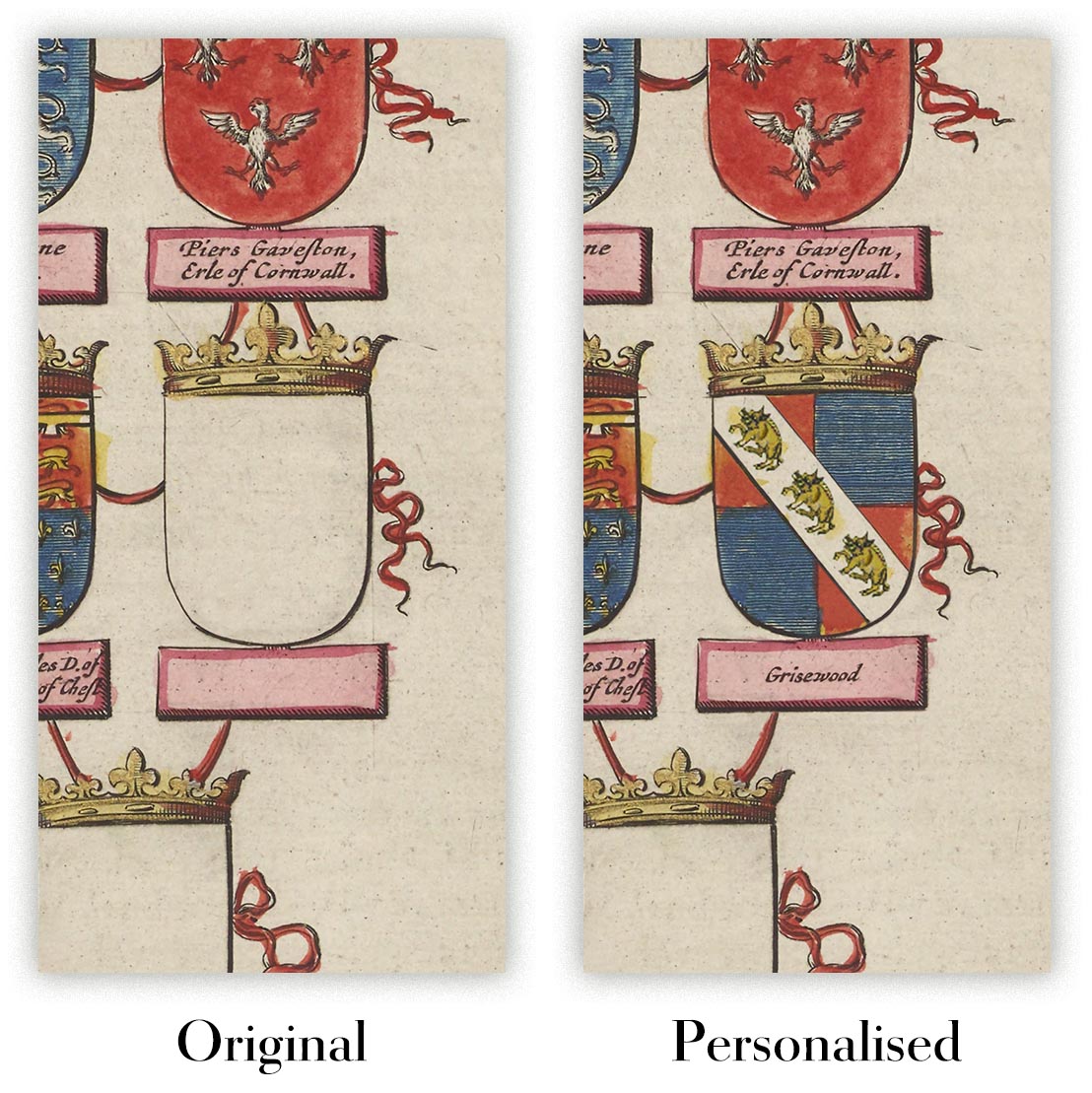
Wenn Sie nach dem perfekten Geschenk zum Jahrestag oder zur Einweihung suchen, kann ich Ihre Karte personalisieren, um sie wirklich einzigartig zu machen. Ich kann beispielsweise eine kurze Nachricht hinzufügen, einen wichtigen Ort hervorheben oder das Wappen Ihrer Familie hinzufügen.
Die Möglichkeiten sind nahezu unbegrenzt. Bitte sehen Sie sich meine Kartenpersonalisierungsseite für einige wunderbare Beispiele dessen, was möglich ist.
Um eine personalisierte Karte zu bestellen, wählen Sie „Personalisieren Sie Ihre Karte“, bevor Sie sie in den Warenkorb legen.
In Kontakt kommen wenn Sie nach komplexeren Anpassungen und Personalisierungen suchen.
Kartenalterung
Im Laufe der Jahre wurde ich von Kunden hunderte Male gefragt, ob sie eine Karte kaufen könnten, die noch älter.
Nun, jetzt können Sie das, indem Sie „Alter“ auswählen, bevor Sie eine Karte in Ihren Warenkorb legen.
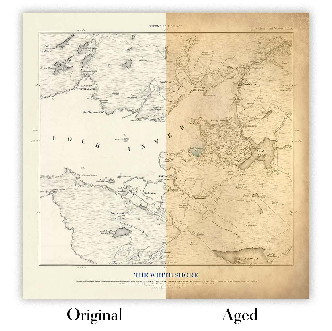
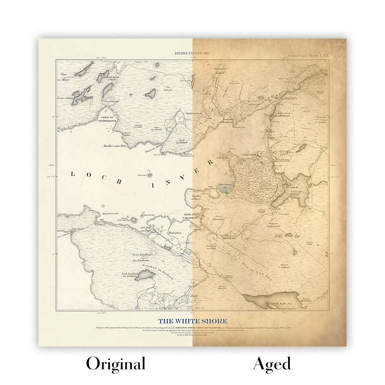
Alle Produktfotos, die Sie auf dieser Seite sehen, zeigen die Karte in ihrer Originalform. So sieht die Karte heute aus.
Wenn Sie „Gealtert“ auswählen, werde ich Ihre Karte von Hand altern lassen. Dazu verwende ich ein spezielles und einzigartiges Verfahren, das ich durch jahrelanges Studium alter Karten und Gespräche mit Forschern zum Verständnis der Chemie alternder Papiere entwickelt habe, und natürlich ... viel Übung!
Wenn Sie sich nicht sicher sind, bleiben Sie bei der Originalfarbe der Karte. Wenn Sie etwas Dunkleres und älter Wenn Sie auf der Suche sind, entscheiden Sie sich für „Aged“.
Sehen Sie einige erstaunliche Beispiele für gealterte Karten.
Seit 1984 restaurieren und fertigen wir Karten und Kunstdrucke an, und wir stehen hinter jedem einzelnen Stück.
Jede Bestellung ist durch unsere 10-Jahres-Garantie und unsere Garantie für beschädigungsfreie Lieferung abgesichert. Sollte Ihr Stück beschädigt bei Ihnen ankommen, ersetzen oder reproduzieren wir es kostenlos. Sollte sonst etwas nicht in Ordnung sein, kontaktieren Sie unser Werkstatt-Team, und wir kümmern uns umgehend darum.
Ausführliche Informationen finden Sie in unseren Rückgabe- und Erstattungsrichtlinien.


