










Wilhelm Remmer Brewery Vintage Wheat Beer Poster by Hollerbaum & Schmidt, 1900
Œuvre d’art authentique
L’œuvre que nous imprimons est fidèlement restituée à partir de la source originale - généralement un musée, une bibliothèque ou une collection privée. Nous ne remplaçons jamais, ne redessinons jamais et n’inventons jamais le travail de l’artiste à l’aide d’une IA générative.
Restaurée dans notre atelier londonien à partir de l’œuvre originale de 1900 et imprimée en qualité musée. Description complète
L’offre du collectionneur
Choisissez deux œuvres éligibles et bénéficiez de 20 % de réduction sur les deux. Choisissez-en trois et celle au prix le plus bas est offerte, pour une économie maximale de 33 %.
Associez librement des cartes standard éligibles et des tirages d’art. Aucun code n’est requis ; l’offre est appliquée automatiquement lors du paiement.
Les configurations standard réalisées sur commande sont incluses. Les formats sur mesure, les créations personnalisées et les œuvres commissionnées sont exclus.
Besoin d’une livraison à différentes adresses ? Contactez-nous avant de commander.L’offre du collectionneur
Choisissez deux œuvres éligibles et bénéficiez de 20 % de réduction sur les deux. Choisissez-en trois et celle au prix le plus bas est offerte, pour une économie maximale de 33 %.
Associez librement des cartes standard éligibles et des tirages d’art. Aucun code n’est requis ; l’offre est appliquée automatiquement lors du paiement.
Les configurations standard réalisées sur commande sont incluses. Les formats sur mesure, les créations personnalisées et les œuvres commissionnées sont exclus.
Besoin d’une livraison à différentes adresses ? Contactez-nous avant de commander.Œuvre d’art authentique
L’œuvre que nous imprimons est fidèlement restituée à partir de la source originale - généralement un musée, une bibliothèque ou une collection privée. Nous ne remplaçons jamais, ne redessinons jamais et n’inventons jamais le travail de l’artiste à l’aide d’une IA générative.
Restaurée à partir de l’œuvre originale de 1900 et imprimée en qualité musée. Description complète
Choisissez votre format
Choisissez votre finition


(Plus d’infos)
Message cadeau & finition personnalisée

Si vous souhaitez ajouter un message cadeau, ou une finition (puzzle, panneau en aluminium, etc.) qui n'est pas disponible ici, veuillez le demander dans la "note de commande" lors de votre passage à la caisse.
Chaque commande est fabriquée sur mesure, donc si vous avez besoin d'ajuster légèrement la taille, ou d'imprimer sur un matériau inhabituel, faites-le nous savoir. Nous avons réalisé des milliers de commandes personnalisées au fil des ans, donc il n'y a (presque) rien que nous ne puissions gérer.
Vous pouvez également nous contacter avant de passer votre commande, si vous le souhaitez !
Le choix des collectionneurs, des décorateurs et de ceux qui souhaitent faire plaisir
Plus de 8 000 avis 5 étoiles

Wilhelm Remmer Brauerei, created by the German design firm Hollerbaum & Schmidt around 1900, turns a beer barrel into an emphatic piece...
Continuer la lectureWilhelm Remmer Brauerei, created by the German design firm Hollerbaum & Schmidt around 1900, turns a beer barrel into an emphatic piece of commercial theatre. The great brown cask stands squarely at the centre of the vertical composition, its rounded volume set against an uninterrupted field of vivid yellow. Above it, the brewery’s name stretches across the poster in large decorative lettering, establishing a hierarchy that is immediate and difficult to overlook: name first, product second, all extraneous detail removed.
The poster belongs to a period in which advertising was becoming an increasingly visible part of urban life. Breweries, like other competing manufacturers, needed recognisable public identities, and the large-format poster offered a way to communicate quickly to people in streets, stations and places of entertainment. Hollerbaum & Schmidt’s design demonstrates the economy required by that setting. Rather than surrounding the product with anecdote or a crowded drinking scene, the firm reduces the message to a few memorable elements: saturated colour, forceful typography and the familiar form of the barrel itself.
A closer look
The barrel is more carefully articulated than the poster’s bold first impression might suggest. Fine vertical marks evoke separate wooden staves and a subdued grain, while curved edges, darker shading and restrained highlights give the cask a sense of weight. Its rich brown tones sit firmly against the hotter yellow and orange palette, allowing a solid, almost sculptural object to emerge from an otherwise flat graphic field. A dark base along the lower edge further anchors the barrel, preventing it from seeming to float within the brilliant background.
Across the upper section, “WILHELM REMMER BRAUEREI” is treated not as supplementary information but as a principal visual form. The brown lettering contrasts crisply with the yellow ground, its decorative character lending the brewery name a distinctive silhouette. The eye moves naturally from this broad typographic header down to the barrel and then to the smaller label attached to its front. This descending structure makes the advertisement legible at more than one distance: the name and product can be grasped instantly, while the finer label rewards closer inspection.
That label introduces a concentrated area of ornament within the otherwise spare composition. Its pale ground breaks across the brown cask, framing the words “ECHTES WEIZENBIER aus der Brauerei von WILHELM REMMER” in dark serif type. Geometric borders, coloured dots and a small flag-like element add intricacy without competing with the larger message. The contrast between these compact details and the broad surrounding colour fields is central to the design’s effectiveness: information is gathered into a precise focal point, while the rest remains strikingly uncluttered.
Context and significance
Turn-of-the-century commercial posters often had to reconcile two distinct purposes. They needed the visual presence to command attention in a crowded public environment, but they also had to fix a product and company name in the memory. Here, the brewery’s identity is made inseparable from a single, easily recognised object. The barrel functions simultaneously as product container, emblem and compositional anchor, while the limited palette gives the advertisement unusual coherence.
What remains especially compelling is the poster’s disciplined balance between description and abstraction. The cask is tangible enough to convey wood, curvature and mass, yet the yellow ground, flattened colour and assertive type keep the design firmly within the language of graphic advertising. Hollerbaum & Schmidt created an image that says little in literal terms, but says it with exceptional clarity—a compact example of how commercial art around 1900 could turn an everyday commodity into a bold public symbol.
Choosing the right size and finish
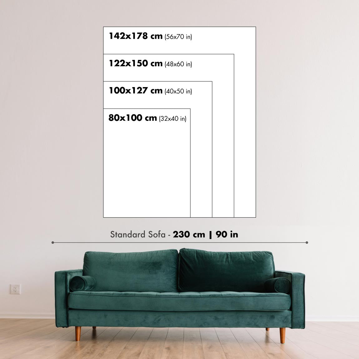
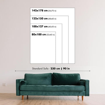
Artwork can feel intimate at smaller sizes and dramatically more architectural at larger ones. Use the room preview, model image and size guide to see how the proportions and scale will work in your space.
If you need an exact size, specialist framing or help planning a larger display, ask our workshop for advice.
The model in the listing images is holding the 24x36in (60x90cm) version of this art print.
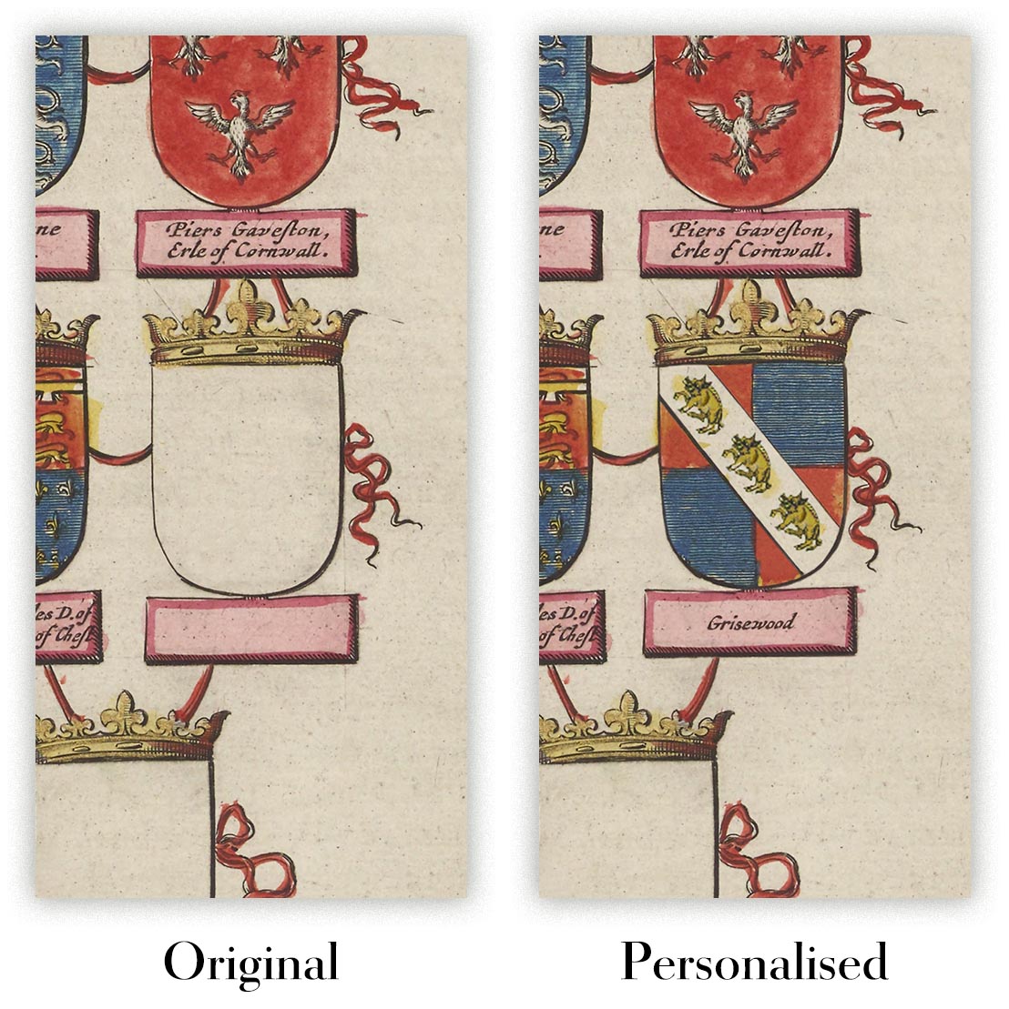
Where personalisation is available, you can add a short title or dedication, or one considered visual detail. See examples of personalised artwork.
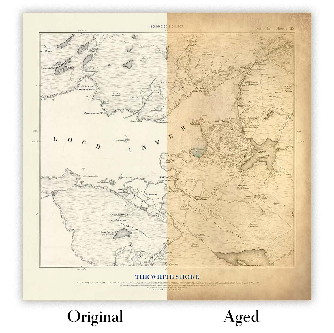
Choose Original to retain the colour and character of the source artwork, or Aged for a warmer, more antique appearance. See examples of our Aged artwork.
Every piece is produced to archival standards using fade-resistant pigment inks on acid-free matte art paper. Choose an art print, framed art print or framed canvas using the finish options above.
Framed art prints use crystal-clear optical acrylic for excellent clarity, lower weight and safer delivery than glass. Each piece arrives professionally framed and ready to hang.
Selected artworks can be produced at statement sizes up to 3 metres (10ft). Custom sizing and specialist framing are also available. If the exact option you need is not listed, contact our workshop.
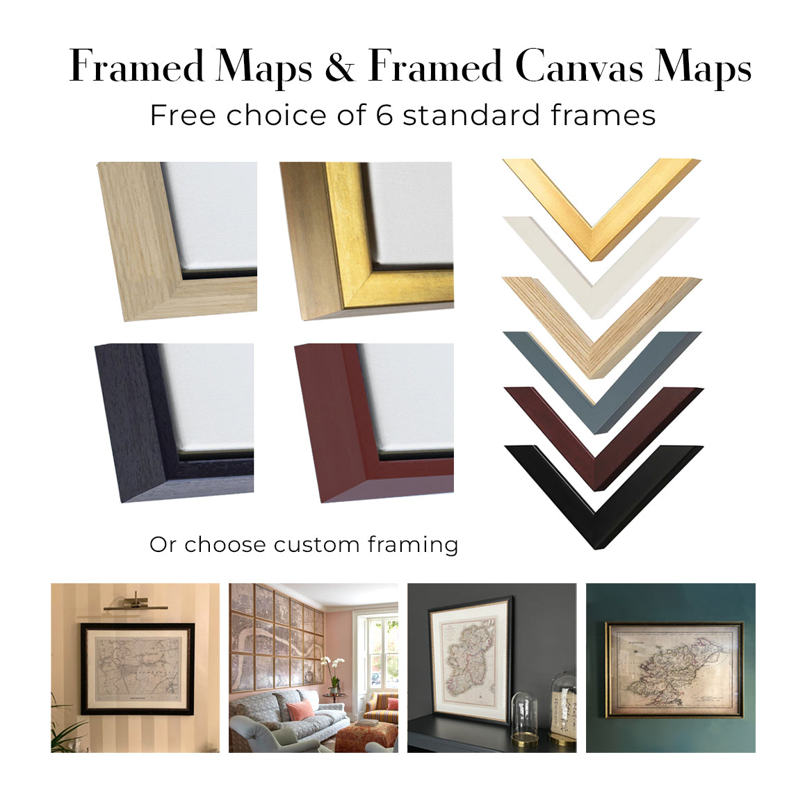
This artwork is also available as a float framed canvas, sometimes known as a shadow gap framed canvas or canvas floater. The work is printed on artist's cotton canvas and then stretched over a handmade box frame. We then "float" the canvas inside a wooden frame, which is available in a range of colours (black, dark brown, oak, antique gold and white). This is a wonderful way to present an art print without glazing in front. See some examples of float framed canvas art and explore the differences between my different finishes.
Wilhelm Remmer Brauerei, created by the German design firm Hollerbaum & Schmidt around 1900, turns a beer barrel into an emphatic piece of commercial theatre. The great brown cask stands squarely at the centre of the vertical composition, its rounded volume set against an uninterrupted field of vivid yellow. Above it, the brewery’s name stretches across the poster in large decorative lettering, establishing a hierarchy that is immediate and difficult to overlook: name first, product second, all extraneous detail removed.
The poster belongs to a period in which advertising was becoming an increasingly visible part of urban life. Breweries, like other competing manufacturers, needed recognisable public identities, and the large-format poster offered a way to communicate quickly to people in streets, stations and places of entertainment. Hollerbaum & Schmidt’s design demonstrates the economy required by that setting. Rather than surrounding the product with anecdote or a crowded drinking scene, the firm reduces the message to a few memorable elements: saturated colour, forceful typography and the familiar form of the barrel itself.
A closer look
The barrel is more carefully articulated than the poster’s bold first impression might suggest. Fine vertical marks evoke separate wooden staves and a subdued grain, while curved edges, darker shading and restrained highlights give the cask a sense of weight. Its rich brown tones sit firmly against the hotter yellow and orange palette, allowing a solid, almost sculptural object to emerge from an otherwise flat graphic field. A dark base along the lower edge further anchors the barrel, preventing it from seeming to float within the brilliant background.
Across the upper section, “WILHELM REMMER BRAUEREI” is treated not as supplementary information but as a principal visual form. The brown lettering contrasts crisply with the yellow ground, its decorative character lending the brewery name a distinctive silhouette. The eye moves naturally from this broad typographic header down to the barrel and then to the smaller label attached to its front. This descending structure makes the advertisement legible at more than one distance: the name and product can be grasped instantly, while the finer label rewards closer inspection.
That label introduces a concentrated area of ornament within the otherwise spare composition. Its pale ground breaks across the brown cask, framing the words “ECHTES WEIZENBIER aus der Brauerei von WILHELM REMMER” in dark serif type. Geometric borders, coloured dots and a small flag-like element add intricacy without competing with the larger message. The contrast between these compact details and the broad surrounding colour fields is central to the design’s effectiveness: information is gathered into a precise focal point, while the rest remains strikingly uncluttered.
Context and significance
Turn-of-the-century commercial posters often had to reconcile two distinct purposes. They needed the visual presence to command attention in a crowded public environment, but they also had to fix a product and company name in the memory. Here, the brewery’s identity is made inseparable from a single, easily recognised object. The barrel functions simultaneously as product container, emblem and compositional anchor, while the limited palette gives the advertisement unusual coherence.
What remains especially compelling is the poster’s disciplined balance between description and abstraction. The cask is tangible enough to convey wood, curvature and mass, yet the yellow ground, flattened colour and assertive type keep the design firmly within the language of graphic advertising. Hollerbaum & Schmidt created an image that says little in literal terms, but says it with exceptional clarity—a compact example of how commercial art around 1900 could turn an everyday commodity into a bold public symbol.
Choosing the right size and finish
Artwork can feel intimate at smaller sizes and dramatically more architectural at larger ones. Use the room preview, model image and size guide to see how the proportions and scale will work in your space.
If you need an exact size, specialist framing or help planning a larger display, ask our workshop for advice.
The model in the listing images is holding the 24x36in (60x90cm) version of this art print.
Where personalisation is available, you can add a short title or dedication, or one considered visual detail. See examples of personalised artwork.
Choose Original to retain the colour and character of the source artwork, or Aged for a warmer, more antique appearance. See examples of our Aged artwork.
Every piece is produced to archival standards using fade-resistant pigment inks on acid-free matte art paper. Choose an art print, framed art print or framed canvas using the finish options above.
Framed art prints use crystal-clear optical acrylic for excellent clarity, lower weight and safer delivery than glass. Each piece arrives professionally framed and ready to hang.
Selected artworks can be produced at statement sizes up to 3 metres (10ft). Custom sizing and specialist framing are also available. If the exact option you need is not listed, contact our workshop.
This artwork is also available as a float framed canvas, sometimes known as a shadow gap framed canvas or canvas floater. The work is printed on artist's cotton canvas and then stretched over a handmade box frame. We then "float" the canvas inside a wooden frame, which is available in a range of colours (black, dark brown, oak, antique gold and white). This is a wonderful way to present an art print without glazing in front. See some examples of float framed canvas art and explore the differences between my different finishes.
Nombre de nos cartes et tirages d’art sont choisis comme cadeaux attentionnés pour des intérieurs, des bureaux, des cabinets de travail et des lieux chargés de sens.
Choisissez une option encadrée pour un cadeau prêt à être accroché en toute simplicité, ou optez pour un tirage non encadré si le destinataire préfère peut-être sélectionner son propre cadre.
Nous fabriquons les commandes localement dans 23 pays à travers le monde, afin que les cadeaux puissent souvent être produits à proximité du destinataire. Cela permet une livraison plus rapide, un transport plus sûr et d’éviter les surprises liées aux frais de douane ou droits d’importation.
- Nous pouvons livrer directement au destinataire
- Les pièces encadrées arrivent prêtes à être accrochées
- Les tirages non encadrés sont soigneusement emballés dans un tube de protection robuste
- Presque chaque commande est fabriquée localement, pour des cadeaux plus rapides et plus sûrs
- Les retours sous 90 jours laissent au destinataire le temps de se décider
Si vous hésitez sur le choix à faire, veuillez nous contacter. Nous pouvons vous aider à choisir la carte, le format, la finition ou l’option de livraison appropriés.
Pour la plupart des commandes, le délai de livraison est d'environ 3 jours ouvrables. Les produits personnalisés et sur mesure prennent plus de temps, car je dois faire la personnalisation et vous l'envoyer pour approbation, ce qui prend généralement 1 ou 2 jours.
Veuillez noter que les grandes commandes encadrées prennent généralement plus de temps à réaliser et à livrer.
Si vous avez besoin que votre commande arrive à une date précise, veuillez me contacter avant de passer votre commande afin que nous puissions trouver le meilleur moyen de nous assurer que vous receviez votre commande à temps.
J'imprime et encadre des cartes et des œuvres d'art dans 23 pays à travers le monde. Cela signifie que votre commande sera réalisée localement, ce qui réduit le temps de livraison et garantit qu'elle ne sera pas endommagée pendant le transport. Vous ne paierez jamais de droits de douane ou d'importation, et nous mettrons moins de CO2 dans l'air.
Toutes mes cartes et impressions artistiques sont bien emballées et envoyées dans un tube robuste si non encadrées, ou entourées de mousse si encadrées.
J'essaie d'envoyer toutes les commandes dans les 1 ou 2 jours suivant la réception de votre commande, bien que certains produits (comme les masques, les mugs et les sacs fourre-tout) puissent prendre plus de temps à réaliser.
Si vous choisissez Livraison Express lors du paiement, nous donnerons la priorité à votre commande et l'enverrons par un service de messagerie de 1 jour (Fedex, DHL, UPS, Parcelforce).
La livraison le lendemain est également disponible dans certains pays (États-Unis, Royaume-Uni, Singapour, Émirats Arabes Unis), mais veuillez essayer de commander tôt dans la journée afin que nous puissions l'envoyer à temps.
Lisez mon guide complet sur la livraison et la production locale
Mon cadre standard est un cadre en bois dur noir de style galerie. Il est simple et a un aspect assez moderne. Mon cadre standard mesure environ 20 mm (0,8 po) de large.
J'utilise de l'acrylique super clair (perspex/acrylite) pour le verre du cadre. C'est plus léger et plus sûr que le verre - et cela a meilleur aspect, car la réflexivité est plus faible.
Six couleurs de cadre standard sont disponibles gratuitement (noir, marron foncé, gris foncé, chêne, blanc et or antique). Des encadrements et montages/matelassages personnalisés sont disponibles si vous recherchez autre chose.
La plupart des cartes, œuvres d'art et illustrations sont également disponibles sous forme de toile encadrée. Nous utilisons une toile en coton mate (non brillante), que nous tendons sur un cadre en bois de boîte provenant de sources durables, puis nous 'flottions' la pièce à l'intérieur d'un cadre en bois. Le résultat final est assez beau, et il n'y a pas de vitrage qui gêne.
Tous les cadres sont fournis "prêts à accrocher", avec soit une corde, soit des supports à l'arrière. Les très grands cadres auront des plaques de suspension lourdes et/ou une latte de montage. Si vous avez des questions, veuillez nous contacter.
Voir quelques exemples de mes cartes encadrées et de cartes en toile encadrées.
Alternativement, je peux également fournir de vieilles cartes et œuvres d'art sur toile, sur panneau en mousse, en coton et d'autres matériaux.
Si vous souhaitez encadrer votre carte ou œuvre d'art vous-même, veuillez lire d'abord mon guide des tailles.
Nous travaillons avec des architectes d’intérieur, des établissements hôteliers, des professionnels de l’immobilier, des bureaux et des acheteurs d’entreprise, pour des pièces individuelles comme pour des projets coordonnés de plus grande envergure.
Cette œuvre peut être adaptée à un mur, une pièce ou un projet spécifique, et notre atelier peut vous aider à coordonner les dimensions, le matériau et l’encadrement avant la production.
- Dimensions exactes, grand format et sur mesure
- Encadrement, montage et matériaux alternatifs sur mesure
- Pièces coordonnées pour plusieurs pièces ou emplacements
- Personnalisation de l’œuvre, pour ajuster la couleur et le style de la pièce
- Conseils de notre atelier sur l’œuvre et l’encadrement
- Production locale pour des projets dans le monde entier
Échangez avec notre équipe Trade & Projects au sujet de cette pièce
Chaque impression artistique restaurée commence par l’œuvre originale de l’artiste — jamais par un substitut généré par IA.
Notre atelier de Londres travaille à partir de documents source soigneusement sélectionnés dans des musées, bibliothèques, archives et collections privées. Nous restaurons les dommages liés à l’âge, les couleurs passées et les défauts de reproduction, tout en préservant la composition, les coups de pinceau, le trait, la texture et le caractère d’époque de l’artiste.
Nous n’utilisons pas d’IA générative pour redessiner, réinterpréter ou inventer l’œuvre. La restauration numérique est utilisée uniquement pour récupérer et reproduire l’œuvre originale aussi fidèlement que possible.
Une fois restaurée, l’œuvre maîtresse est préparée dans le format et la finition que vous avez choisis. Votre pièce est ensuite imprimée et, le cas échéant, encadrée à proximité de sa destination de livraison.
Nos impressions d’art giclée utilisent un papier mat d’archivage sans acide de 200 g/m² et des encres pigmentaires résistantes à la décoloration pour une finition riche, digne d’un musée. Les impressions d’art encadrées utilisent un acrylique optique cristallin et arrivent prêtes à être accrochées.
Des toiles encadrées et des éditions spécialisées sur papier coton-rag sont également disponibles. En savoir plus sur nos matériaux et finitions.
Nous restaurons et produisons des cartes et des tirages d’art depuis 1984, et nous garantissons chaque pièce.
Chaque commande est couverte par notre garantie de 10 ans et notre garantie de livraison sans dommage. Si votre pièce arrive endommagée, nous la remplacerons ou la referons gratuitement. Si quoi que ce soit d’autre ne vous donne pas entière satisfaction, contactez notre équipe d’atelier et nous y remédierons rapidement.
Consultez notre politique de retours et de remboursement pour plus de détails.


