










Elixir La Japonaise Vintage Liqueur Poster, 1895
Authentic artwork
The artwork we print is faithfully restored from the original source - usually a museum, auction house or private collection.
We never replace, redraw or invent the artist’s work using generative AI.
Restored in our London workshop from the original 1895 artwork and printed to museum-grade archival standards. Full description
The Collector’s Offer
Choose two eligible works and receive 20% off both. Choose three and the lowest-priced one is complimentary, a maximum saving of 33%.
Mix and match eligible standard maps and fine-art prints. No code is required; the offer is applied automatically at checkout.
Standard made-to-order configurations are included. Bespoke sizes, personalised designs and commissioned work are excluded.
Need delivery to different addresses? Contact us before ordering.The Collector’s Offer
Choose two eligible works and receive 20% off both. Choose three and the lowest-priced one is complimentary, a maximum saving of 33%.
Mix and match eligible standard maps and fine-art prints. No code is required; the offer is applied automatically at checkout.
Standard made-to-order configurations are included. Bespoke sizes, personalised designs and commissioned work are excluded.
Need delivery to different addresses? Contact us before ordering.Authentic artwork
The artwork we print is faithfully restored from the original source - usually a museum, auction house or private collection.
We never replace, redraw or invent the artist’s work using generative AI.
Restored from the original 1895 artwork and printed to museum-grade archival standards. Full description
Choose your size
Choose your finish


(More info)
Gift message & custom finish

If you want to add a gift message, or a finish (jigsaw, aluminium board, etc.) that is not available here, please request it in the "order note" when you check out.
Every order is custom made, so if you need the size adjusted slightly, or printed on an unusual material, just let us know. We've done thousands of custom orders over the years, so there's (almost) nothing we can't manage.
You can also contact us before you order, if you prefer!
Chosen by collectors, designers and gift buyers
8,000+ five-star reviews

Elixir La Japonaise, made by Litho Myncke in 1895, turns a beverage advertisement into a densely staged vision of Japan. A woman...
Continue readingElixir La Japonaise, made by Litho Myncke in 1895, turns a beverage advertisement into a densely staged vision of Japan. A woman in a brilliant yellow-and-red kimono occupies the foreground, holding a stringed instrument as blossoms, lanterns, bamboo and distant buildings gather around her. Below, the advertised bottle is given conspicuous prominence, while the product name arches across the upper field in large ornamental lettering. The poster’s force comes from this emphatic hierarchy: figure, title and bottle can each be understood at a glance, yet the surrounding detail rewards much slower attention.
Created during the fin-de-siècle expansion of printed advertising, the design belongs to a period in which the commercial poster became an unusually fertile meeting place for illustration, typography and publicity. Its Japanese theme reflects the wider European fascination with Japanese art and design in the later nineteenth century, but it also exemplifies the exoticised branding of the era. Rather than documenting a particular place, Elixir La Japonaise assembles recognisable motifs into an imaginative setting designed to make the liqueur seem distinctive. The smaller inscription identifies it as a “liqueur hygiénique japonaise” distilled by G. Van Hoorebeke in Ghent—“Gand” in the French text—linking the invented Far Eastern atmosphere to a Belgian product.
A closer look
The central figure is built from decisive areas of flat colour and crisply defined contour. Her yellow robe forms the brightest and largest shape in the composition, punctuated by red and traced with fine black lines that articulate its textile pattern. Dark hair and decorative ornaments frame her composed face, while the instrument introduces a strong diagonal across the body. This contrast between an immediately legible silhouette and intricate internal patterning is central to the poster’s graphic effectiveness.
Behind her, the space remains deliberately shallow. Green foliage and grass lead towards stylised architecture, while hanging lanterns and bamboo-like forms help frame the upper scene. Pink blossoms cluster particularly vividly at the lower right, softening the harder geometry of the lettering and bottle. The palette moves between warm yellow, scarlet and pink, cooler blue passages, and a broad field of green; the resulting contrasts keep the eye circulating rather than settling on a single detail.
Typography is integrated into this ornamental structure rather than treated as an afterthought. “ELIXIR LA JAPONAISE” commands the top of the poster, with “ELIXIR” slightly raised to establish a clear reading order. Beneath it, the more compact product description supplies practical information without surrendering decorative character. At the lower centre, the bottle functions almost like a second protagonist: its elaborate label condenses the larger poster’s appetite for colour, border and embellishment into miniature form. An enclosing decorative border further binds the various components into one coherent display.
Context and significance
By the 1890s, advances in colour lithography had enabled advertisers to compete for attention through larger, brighter and more elaborate designs. Posters were not simply notices; they helped construct a product’s identity through memorable figures, settings and type. Here, Litho Myncke combines the directness required of street advertising with the decorative density associated with late nineteenth-century visual culture. The result reveals how readily commerce drew upon contemporary enthusiasms for distant places and cultures.
Seen today, Elixir La Japonaise is compelling both for its exuberant design and for what it discloses about European advertising in 1895. Its imagined Japan is plainly a promotional fantasy, assembled from selected visual signs rather than presented as an ethnographic account. That tension—between accomplished graphic invention and exoticised representation—makes the poster especially revealing: a vivid record of how colour, typography and cultural association were enlisted to give an everyday beverage an alluring identity.
Choosing the right size and finish
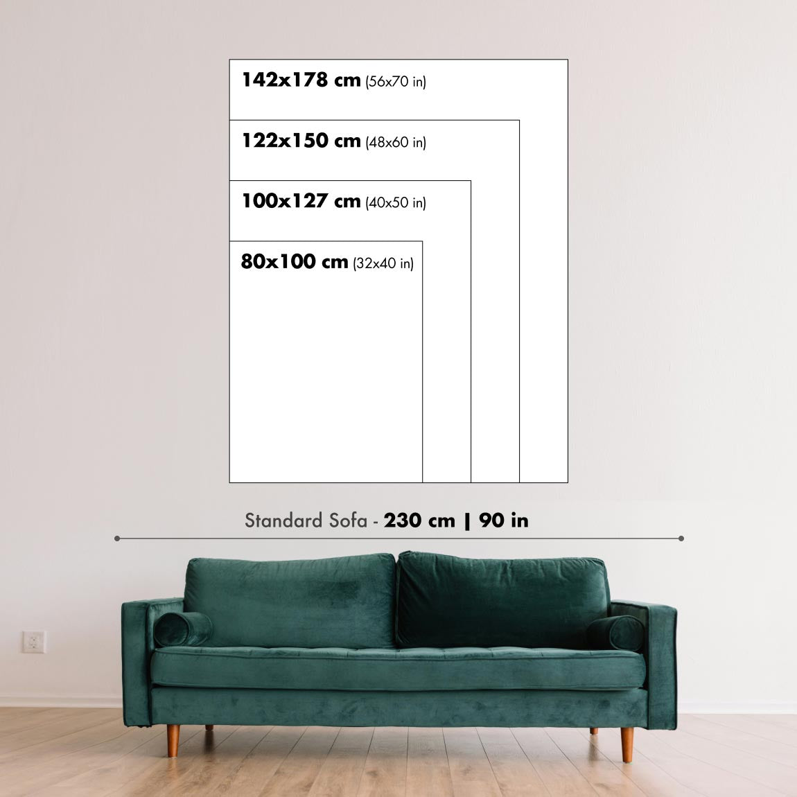
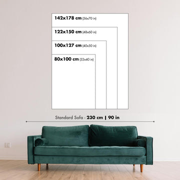
Artwork can feel intimate at smaller sizes and dramatically more architectural at larger ones. Use the room preview, model image and size guide to see how the proportions and scale will work in your space.
If you need an exact size, specialist framing or help planning a larger display, ask our workshop for advice.
The model in the listing images is holding the 24x36in (60x90cm) version of this art print.
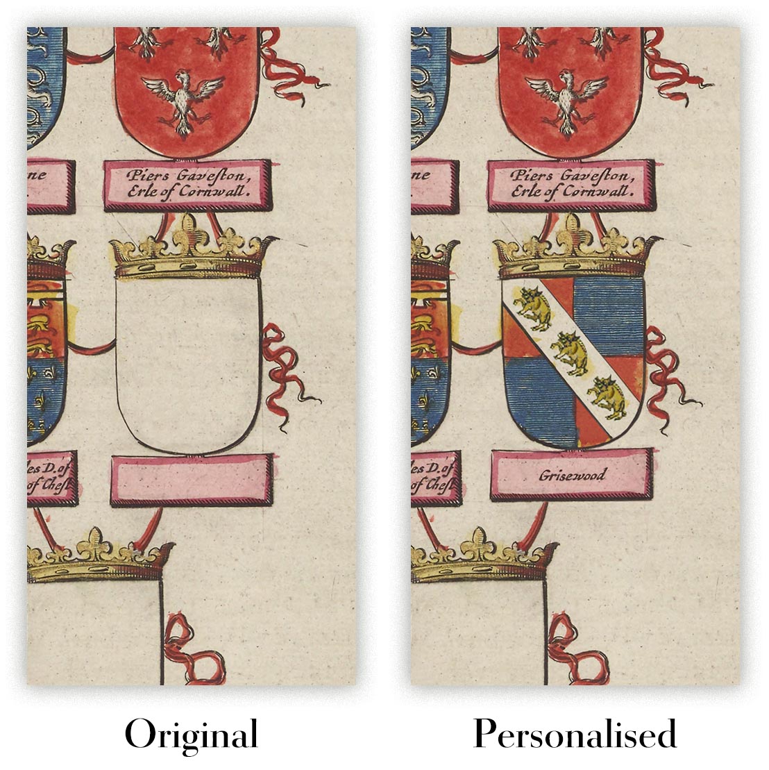
Where personalisation is available, you can add a short title or dedication, or one considered visual detail. See examples of personalised artwork.
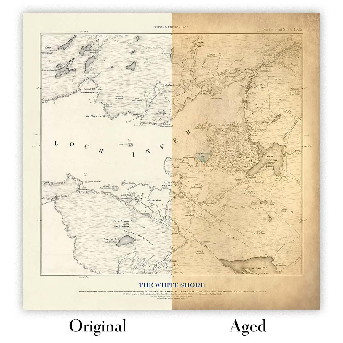
Choose Original to retain the colour and character of the source artwork, or Aged for a warmer, more antique appearance. See examples of our Aged artwork.
Every piece is produced to archival standards using fade-resistant pigment inks on acid-free matte art paper. Choose an art print, framed art print or framed canvas using the finish options above.
Framed art prints use crystal-clear optical acrylic for excellent clarity, lower weight and safer delivery than glass. Each piece arrives professionally framed and ready to hang.
Selected artworks can be produced at statement sizes up to 3 metres (10ft). Custom sizing and specialist framing are also available. If the exact option you need is not listed, contact our workshop.
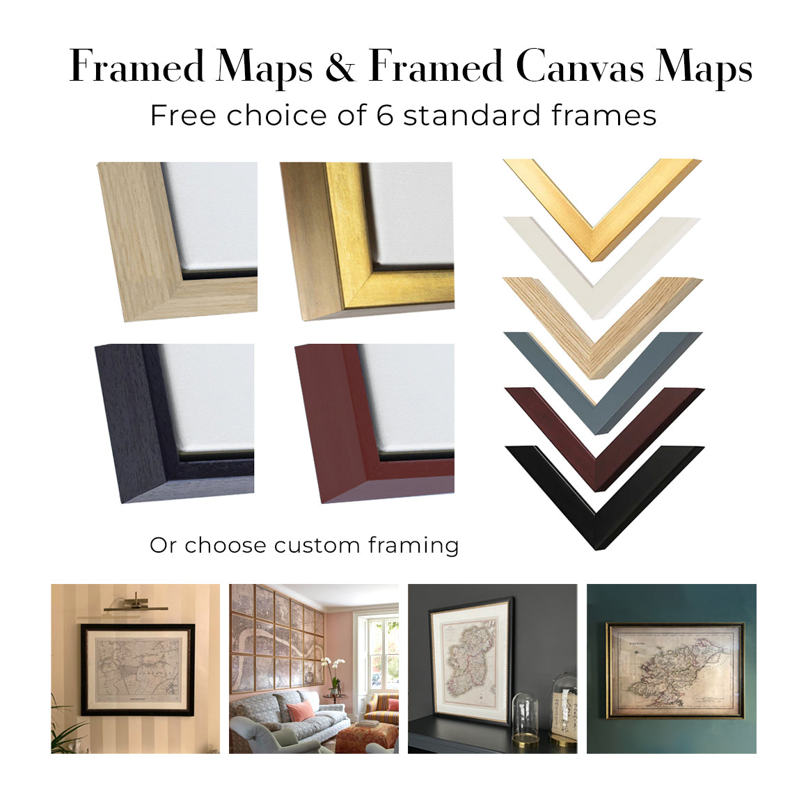
This artwork is also available as a float framed canvas, sometimes known as a shadow gap framed canvas or canvas floater. The work is printed on artist's cotton canvas and then stretched over a handmade box frame. We then "float" the canvas inside a wooden frame, which is available in a range of colours (black, dark brown, oak, antique gold and white). This is a wonderful way to present an art print without glazing in front. See some examples of float framed canvas art and explore the differences between my different finishes.
Elixir La Japonaise, made by Litho Myncke in 1895, turns a beverage advertisement into a densely staged vision of Japan. A woman in a brilliant yellow-and-red kimono occupies the foreground, holding a stringed instrument as blossoms, lanterns, bamboo and distant buildings gather around her. Below, the advertised bottle is given conspicuous prominence, while the product name arches across the upper field in large ornamental lettering. The poster’s force comes from this emphatic hierarchy: figure, title and bottle can each be understood at a glance, yet the surrounding detail rewards much slower attention.
Created during the fin-de-siècle expansion of printed advertising, the design belongs to a period in which the commercial poster became an unusually fertile meeting place for illustration, typography and publicity. Its Japanese theme reflects the wider European fascination with Japanese art and design in the later nineteenth century, but it also exemplifies the exoticised branding of the era. Rather than documenting a particular place, Elixir La Japonaise assembles recognisable motifs into an imaginative setting designed to make the liqueur seem distinctive. The smaller inscription identifies it as a “liqueur hygiénique japonaise” distilled by G. Van Hoorebeke in Ghent—“Gand” in the French text—linking the invented Far Eastern atmosphere to a Belgian product.
A closer look
The central figure is built from decisive areas of flat colour and crisply defined contour. Her yellow robe forms the brightest and largest shape in the composition, punctuated by red and traced with fine black lines that articulate its textile pattern. Dark hair and decorative ornaments frame her composed face, while the instrument introduces a strong diagonal across the body. This contrast between an immediately legible silhouette and intricate internal patterning is central to the poster’s graphic effectiveness.
Behind her, the space remains deliberately shallow. Green foliage and grass lead towards stylised architecture, while hanging lanterns and bamboo-like forms help frame the upper scene. Pink blossoms cluster particularly vividly at the lower right, softening the harder geometry of the lettering and bottle. The palette moves between warm yellow, scarlet and pink, cooler blue passages, and a broad field of green; the resulting contrasts keep the eye circulating rather than settling on a single detail.
Typography is integrated into this ornamental structure rather than treated as an afterthought. “ELIXIR LA JAPONAISE” commands the top of the poster, with “ELIXIR” slightly raised to establish a clear reading order. Beneath it, the more compact product description supplies practical information without surrendering decorative character. At the lower centre, the bottle functions almost like a second protagonist: its elaborate label condenses the larger poster’s appetite for colour, border and embellishment into miniature form. An enclosing decorative border further binds the various components into one coherent display.
Context and significance
By the 1890s, advances in colour lithography had enabled advertisers to compete for attention through larger, brighter and more elaborate designs. Posters were not simply notices; they helped construct a product’s identity through memorable figures, settings and type. Here, Litho Myncke combines the directness required of street advertising with the decorative density associated with late nineteenth-century visual culture. The result reveals how readily commerce drew upon contemporary enthusiasms for distant places and cultures.
Seen today, Elixir La Japonaise is compelling both for its exuberant design and for what it discloses about European advertising in 1895. Its imagined Japan is plainly a promotional fantasy, assembled from selected visual signs rather than presented as an ethnographic account. That tension—between accomplished graphic invention and exoticised representation—makes the poster especially revealing: a vivid record of how colour, typography and cultural association were enlisted to give an everyday beverage an alluring identity.
Choosing the right size and finish
Artwork can feel intimate at smaller sizes and dramatically more architectural at larger ones. Use the room preview, model image and size guide to see how the proportions and scale will work in your space.
If you need an exact size, specialist framing or help planning a larger display, ask our workshop for advice.
The model in the listing images is holding the 24x36in (60x90cm) version of this art print.
Where personalisation is available, you can add a short title or dedication, or one considered visual detail. See examples of personalised artwork.
Choose Original to retain the colour and character of the source artwork, or Aged for a warmer, more antique appearance. See examples of our Aged artwork.
Every piece is produced to archival standards using fade-resistant pigment inks on acid-free matte art paper. Choose an art print, framed art print or framed canvas using the finish options above.
Framed art prints use crystal-clear optical acrylic for excellent clarity, lower weight and safer delivery than glass. Each piece arrives professionally framed and ready to hang.
Selected artworks can be produced at statement sizes up to 3 metres (10ft). Custom sizing and specialist framing are also available. If the exact option you need is not listed, contact our workshop.
This artwork is also available as a float framed canvas, sometimes known as a shadow gap framed canvas or canvas floater. The work is printed on artist's cotton canvas and then stretched over a handmade box frame. We then "float" the canvas inside a wooden frame, which is available in a range of colours (black, dark brown, oak, antique gold and white). This is a wonderful way to present an art print without glazing in front. See some examples of float framed canvas art and explore the differences between my different finishes.
Many of our maps and art prints are chosen as thoughtful gifts for homes, offices, studies and meaningful places.
Choose a framed option for the easiest ready-to-hang gift, or choose an unframed print if the recipient may prefer to select their own frame.
We make orders locally in 24 countries around the world, so gifts can often be produced close to the recipient. This helps them arrive faster, travel more safely, and avoid customs or import duty surprises.
- We can deliver directly to the recipient
- Framed pieces arrive ready to hang
- Unframed prints are carefully packed in a strong protective tube
- Almost every order is made locally, for faster, safer gifting
- 90-day returns give the recipient time to decide
If you are not sure what to choose, please contact us. We can help you pick the right map, size, finish or delivery option.
Most orders are made locally and delivered in around 2–3 working days, depending on the product, size and destination.
We print and frame maps and artwork in 24 countries around the world, so your order is usually made close to you or your recipient. That means faster delivery, less time in transit, and no customs or import duty surprises.
Personalised and customised pieces usually take an extra 1–2 working days, because we prepare your design and send it to you for approval before printing.
Very large framed orders can take a little longer, as they need extra care in production and delivery.
Every order is carefully packaged: unframed prints are sent in a strong protective tube, while framed pieces are securely packed with protective materials around the frame.
If you need your order by a particular date, please contact us before ordering. We’ll check the best production route and delivery option for your location.
Express delivery is available at checkout for most countries. Next-day delivery is available in the UK, US, Singapore and the UAE.
Your order is covered by our 90-day returns policy and 10-year guarantee.
Our standard frame is a gallery-style black ash hardwood frame, with a simple, modern look. It is approximately 20mm (0.8in) wide. You can also view some lovely customer photos of framed maps and art.
We use super-clear acrylic glazing, also known as Perspex or Acrylite, instead of traditional glass. It is lighter, safer, and has lower reflectivity, giving the artwork a clearer, cleaner appearance.
Six standard frame colours are available at no extra cost: black, dark brown, dark grey, oak, white, and antique gold. Custom framing and mounting/matting is also available for customers looking for something more specific.
Most maps, art prints, and illustrations are also available as a framed canvas. We use matte cotton canvas, stretch it over a sustainably sourced wooden box frame, and then float the piece within a wooden outer frame. The finished result is beautifully presented, with no glazing between you and the artwork.
All frames are supplied ready to hang, with either string or brackets fitted to the back. Very large frames will include heavy-duty hanging plates and/or a mounting baton. If you have any questions, please get in touch.
We can also supply old maps and artwork on canvas, foam board, cotton rag, and other materials.
If you would prefer to frame your map or artwork yourself, please read our size guide before ordering.
We work with interior designers, hospitality businesses, property professionals, offices and corporate buyers on individual pieces and larger coordinated projects.
This artwork can be adapted for a particular wall, room or project, and our workshop can help coordinate the dimensions, material and framing before production.
- Exact, oversized and made-to-measure dimensions
- Custom framing, mounting and alternative materials
- Coordinated pieces for several rooms or locations
- Art personalisation, to adjust the colour and style of the piece
- Art and framing guidance from our workshop
- Local production for projects around the world
Every restored art print begins with the original artist’s work—never an AI-generated replacement.
Our London studio works from carefully selected source material from museums, libraries, archives and private collections. We restore age-related damage, faded colour and imperfect reproduction while preserving the artist’s composition, brushwork, line, texture and period character.
We do not use generative AI to redraw, reinterpret or invent the artwork. Digital restoration is used only to recover and reproduce the original work as faithfully as possible.
Once restored, the master artwork is prepared for your chosen size and finish. Your piece is then printed and, where selected, framed close to its delivery destination.
Our giclée art prints use acid-free 200gsm archival matte paper and fade-resistant pigment inks for a rich, museum-quality finish. Framed art prints use crystal-clear optical acrylic and arrive ready to hang.
Framed canvas and specialist cotton-rag editions are also available. Learn more about our materials and finishes.
We’ve been restoring and producing maps and art prints since 1984, and we stand behind every piece.
Every order is covered by our 10-year guarantee and damage-free delivery guarantee. If your piece arrives damaged, we’ll replace or remake it free of charge. If anything else isn’t right, contact our workshop team and we’ll put it right promptly.
See our returns and refund policy for full details.


